2.2 Histograms
Objective
To create a histogram in R with the hist function using quantitative data, which is a collection of numbers that represent frequencies (or counts) of events or outcomes that fall into different bins. Each of the bins has a quantitative lower bound, and a quantitative upper bound. [Note: If you are trying to display categorical data, choose a bar chart instead. Histograms are for quantitative data only. HISTOGRAMS ARE NOT THE SAME AS BAR CHARTS!]
Background
Like a bar chart, a histogram uses rectangular segments to visualize data, but in a histogram, the data used to put the observations into groups (or bins) is all quantitative. The lengths of the bars are proportional to the values they represent, and the bars can be oriented vertically or horizontally. To reflect that a histogram contains continuous quantitative data, the bars are mashed up really close to one another, like they're all passengers on a packed subway car. In contrast, there's a little bit of breathing room drawn between the bars on a bar chart because each of our categories are discrete. (To hear this discussion again, but from the perspective of the bar chart, read the chapter on bar charts.)
Histograms are used to visualize distributions of quantitative values. Distributions can be characterized by shape, center, and spread:
- The shape is usually described by one or more of these words: unimodal (meaning one hump or most frequent value, which is called the mode), bimodal (two humps), uniform (where all values have the same probability of being observed in the dataset), skewed right (meaning there's a tail that extends to the right, towards higher values), skewed left (with a tail that extends to the left, towards lower values), and symmetric (meaning you can fold the distribution in half, and you'll get mirror images) or asymmetric (meaning you can't fold it to get mirror images). There are pictures of various distribution shapes on the next page.
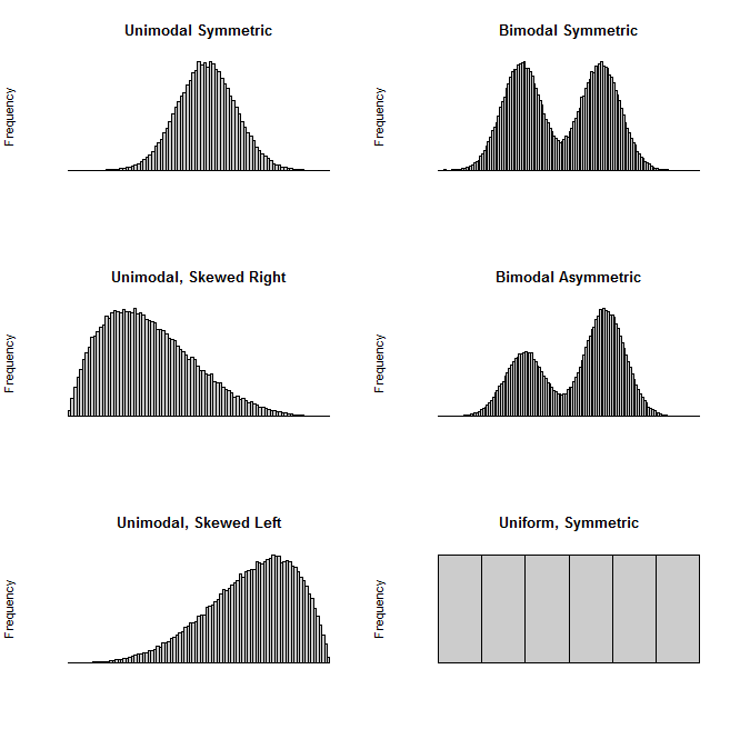
Here are some common histogram shapes. All of these distributions were generated using simulated data. The code that produced the simulated data and the plots can be found at the end of the chapter.
Center just refers to where the middle of the distribution lies. Often, the mean or median are used to describe where the center is. But in the case of a bimodal distribution, it may be more useful to describe the distribution in terms of where the modes can be found. For a uniform distribution, it's really not as useful to describe the center, although you can report the mean of the data set.
Spread indicates the variability and extent of your data... in short, how spread out it is. You can describe spread in terms of variance or standard deviation (the square root of the variance). Another way to report spread is with range, which is the distance between the smallest value in your dataset to the largest (just subtract the minimum from the maximum). (In other contexts, such as electronics and photography, we call the ratio of the largest to the smallest value dynamic range).
Creating a Histogram
Generating a histogram is extremely easy. (This example will use simulated data, but if you have your own data stored in a CSV or text file, you can load that into a data frame first, and then create a histogram from your data.)
First, let's generate some data by randomly sampling 5000 values from a beta distribution with shape parameters α=5 and β=2. The beta distribution takes on many shapes, and when you specify your shape parameters like this, you'll end up with a unimodal distribution that's skewed to the left:
Before we create the histogram, let's take a look at the data by pulling up some descriptive statistics with the summary command, then we'll calculate the standard deviation using sd, and the variance using var. Note that the standard deviation is just the square root of the variance.
Min. 1st Qu. Median Mean 3rd Qu. Max.
0.1138 0.6223 0.7451 0.7202 0.8427 0.9990
Although we'll need to plot our histogram to describe the shape of the distribution, we can tell from the descriptive statistics that this distribution is skewed to the left: the median is at 0.7451, but the mean is slightly pulled to the left at 0.7202 indicating that there's a tail on the left. The spread of our data can be described by the standard deviation, which is approximately 0.162, and the range, which is (0.9990 - 0.1138) = 0.8852. Create your histogram like this:
But there are all sorts of enhancements that we can use to make our histogram more descriptive, and prettier. One thing I like to do is to plot my histogram in terms of density instead of frequency. Frequency (the number of times you observe a value in a particular bin) will depend on your sample size, whereas density does not. By plotting the histogram in terms of density, we can then draw a pretty curve on top of our data which shows the kernel density estimation. (Those are just fancy words that describe one process for trying to estimate the continuous distribution that a discrete data set represents.)
Here are some histograms in base R using frequency (on the left), and one using density (on the right). The plot on the right has a density curve added to make it prettier. The first command sets the plot area to 1 row and 2 columns. The second command plots the histogram on the left. The third command plots the histogram on the right, using the freq=FALSE argument to tell R not to plot the histogram in terms of frequencies. The final line adds a curve on top of the second histogram using the lines command: the density of x will be plotted with density(x), the line type will be "dotted", and we'll make the line width a little thicker (3 pixels) to make it easier to see:
There are many optional arguments that you can add to your histogram using hist, some of which you've seen in the examples above. Here are my favorites.
| Option to hist | What it does |
|---|---|
| main | Specify a main title to be displayed above chart |
| xlab | Specify text to describe the x-axis |
| ylab | Specify text to describe the y-axis |
| breaks=10 | Sets the number of bins to whatever number you specify. I've noticed that R doesn't do this well every single time, so if you don't like your histogram at first, try a different number here. |
| col="purple" | Sets the color of the bars. You can name a color directly, use a hexadecimal code, or specify a color palette which will make each of your bars a different color. |
| freq=FALSE | Plot in terms of density, not frequency |
Supplemental R Code
Here's the base R code that was used to simulate the data and generate the six plots at the beginning of this chapter displayed on the top of p. 92:
# Now plot the histogram in gray, with 100 bars, erasing all axis labels
# Now plot the histogram in gray, with 100 bars, erasing all axis labels
# Randomly sample 100000 times from the beta distribution (which is sort
# Now plot the histogram in gray, with 100 bars, erasing all axis labels
# Now plot the histogram in gray, with 100 bars, erasing all axis labels
# Randomly sample 100000 times from the beta distribution (which is sort
# Now plot the histogram in gray, with 100 bars, erasing all axis labels
Other Resources:
This interactive histogram explainer released in July 2017 is beautiful: https://tinlizzie.org/histograms/#
http://en.wikipedia.org/wiki/Histogram - simple but elegant
http://www.forbes.com/sites/naomirobbins/2012/01/04/a-histogram-is-not-a-bar-chart/ - A Histogram is NOT a Bar Chart! From Forbes magazine
You can read more about kernel density estimation at https://chemicalstatistician.wordpress.com/2013/06/09/exploratory-data-analysis-kernel-density-estimation-in-r-on-ozone-pollution-data-in-new-york-and-ozonopolis/