2.7 Pareto Charts
Objective
To create an ordered bar chart with cumulative frequencies (a Pareto Chart) from a collection of frequencies (or counts) of events or outcomes that fall into different categories. To produce the Pareto Chart, the pareto.chart function from the qcc package can take either 1) a vector (or array) of total counts, or 2) a contingency table containing counts.
Background
A Pareto Chart is a sorted bar chart that displays the frequency (or count) of occurrences that fall in different categories, from greatest frequency on the left to least frequency on the right, with an overlaid line chart that plots the cumulative percentage of occurrences. The vertical axis on the left of the chart shows frequency (or count), and the vertical axis on the right of the chart shows the cumulative percentage.
Primary types or sources of defects
Most frequent reasons for customer complaints
Amount of some variable (e.g. money, energy usage, time) that can be attributed to or classified according to a certain category
The Pareto Chart is used to separate the “vital few” from the “trivial many” using the Pareto principle (or “80/20 Rule”). According to this heuristic, in many systems, approximately 80% of consequences will result from only 20% of causes. The goal in Pareto analysis is to identify those critical concerns so they can be prioritized and addressed.
Option 1: If You Counted Your Observations Already
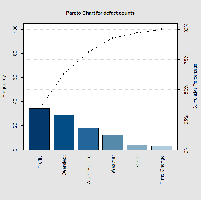
To create a Pareto Chart, you need a vector (or array) of numbers. Typically, this vector will contain counts of the defects (or causes for a certain outcome) in different categories. Here is an example of data generated by surveying 50 people to ask “What are the top 2 reasons you are late to work?” The available answers were 1) bad weather, 2) I overslept, 3) my alarm didn’t go off, 4) I was confused by the time change to/from Daylight Savings Time, 5) traffic was bad, and 6) other.
Store the data in a vector, with names as attributes, for this type of chart:
Note that the order of the counts must be the same as the order of the name labels! For example, there were 12 reports of being late due to bad weather, 29 reports of being late due to oversleeping, 18 reports of being late due to alarm clock problems, and so on.
Next, install the qcc package (if you have not already) and create the Pareto Chart:
Pareto chart analysis for defect.counts
Frequency Cum.Freq. Percentage Cum.Percent.
Traffic 34 34 34 34
Overslept 29 63 29 63
Alarm Failure 18 81 18 81
Weather 12 93 12 93
Other 4 97 4 97
Time Change 3 100 3 100
The chart that this code generates is shown at the top of page 130.
Option 2: If You Need R to Count Your Observations for You
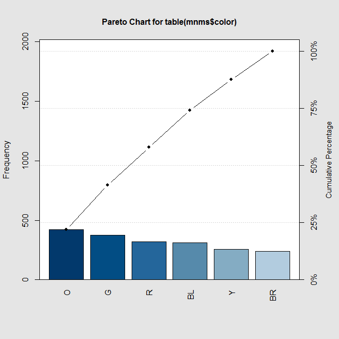
More often, you will have a large file of observations in case format, and you’d like to create a Pareto Chart but you need R to tally up your observations first. Since the pareto.chart function takes a contingency table as an argument, this method is also easy. The example below uses data from 1922 M&Ms published to the web as a CSV file. First, load the data into the variable mnms:
And then, invoke the pareto.chart command on a contingency table for the variable you’re interested in examining:
Pareto chart analysis for table(mnms$color)Frequency Cum.Freq. Percentage Cum.Percent.
O 420.00000 420.00000 21.85224 21.85224
G 375.00000 795.00000 19.51093 41.36316
R 319.00000 1114.00000 16.59729 57.96046
BL 311.00000 1425.00000 16.18106 74.14152
Y 257.00000 1682.00000 13.37149 87.51301
BR 240.00000 1922.00000 12.48699 100.00000
The chart that this code generates is shown at the bottom of page 130. There are many options that you can add to your Pareto Chart, as well:
| Option | What it does |
|---|---|
| main | Specify a main title to be displayed above your chart |
| xlab | Specify a label to display on the x-axis |
| ylab | Specify a label to display on the y-axis |
| col=type(length(defects)) | Sets the color palette to use for the bars in the bar chart (in place of type use heat.colors for reds and oranges, rainbow for ROYGBIV, terrain.colors for earthy greens/grays, topo.colors for deep blues) |
| cex.names=0.5 | Shrinks the fonts on the category labels (values in 0.5-0.8 range usually best) |
| las=1 | Controls orientation of labels on axes (1=all horizontal, 2=all vertical, 3=perpendicular to axes) |
Here’s what the options do in the example at the bottom of the page:
First, pareto.chart creates a Pareto Chart out of the data provided
Then main sets the main title of the graph to be “My Pareto Chart”
The xlab option labels the x-axis with “Reasons”
The ylab option labels the y-axis with “Frequency”
The cex option shrinks the fonts on the x axis to 60% (or 0.6) of original size
The las=1 option orients the category labels horizontally instead of vertically
And the color scheme is chosen from the topo.colors palette, with one color for each of the 6 categories in our original dataset
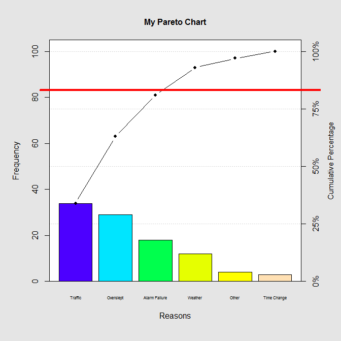
Next, I like to add a horizontal line at the cumulative percentage of 80%. I can place an A-B Line (which is just a funny way to say “line” in R) horizontally (that’s what the h= is for) at the 80% mark on the rightmost scale. I choose red for the color, and set a line width of 4 with lwd=4. For a thinner line, I would pick lwd=2. Here is the code that does that; the chart appears on the next page.
Pareto chart analysis for defect.counts
Frequency Cum.Freq. Percentage Cum.Percent.
Traffic 34 34 34 34
Overslept 29 63 29 63
Alarm Failure 18 81 18 81
Weather 12 93 12 93
Other 4 97 4 97
Time Change 3 100 3 100
Finally, draw a red line on the plot to mark the 80/20:
The Pareto Chart brings immediate focus to which reasons are part of the “vital few” and thus should receive attention first. By dropping a vertical line from where the horizontal line at 80% intersects the cumulative percentage line, this chart shows that traffic, oversleeping, and alarm failure are the most critical reasons that people in our survey are late for work. Our problem-solving activity might use the “5 Whys” technique or create an Ishikawa/ Fishbone Diagram next to determine the root causes of those reasons.
Other Resources:
http://stackoverflow.com/questions/1735540/creating-a-pareto-chart-with-ggplot2-and-r
http://rgm2.lab.nig.ac.jp/RGM2/func.php?rd_id=qcc:pareto.chart