2.3 Segmented Bar Charts
Objective
To create a Segmented (or "Stacked") Bar Chart in R with the barplot function. This uses categorical data, which is a collection of numbers that represent frequencies (or counts) of events or outcomes that fall into different groups or categories. You need to have your data organized in terms of TWO categorical variables for this to work, e.g. in a contingency table.
Background
A segmented bar chart, like a plain-old-ordinary bar chart, uses rectangular segments to visualize categorical data. The lengths of the bars are proportional to the values they represent, and the bars can be oriented vertically or horizontally.
A segmented bar chart has one bar for each level of a particular categorical variable (called a "segment" of the sample).
The segmented bar chart is a frequency distribution. Segmented bar charts are usually scaled so all of the bars reach the 100% mark on the vertical axis.
The information contained in one of the bars is called a conditional distribution, because it's the distribution of observed cases for which the condition of an additional categorical variable having a given value is met.
Data Format
To create a segmented bar chart, all you need is a contingency table containing counts of data organized by at least two categorical variables. The following examples are based on M&M data stored within a CSV (comma separated variable) file published to the web, and the first row of my data file contains variable names. The first four variables are: student, id (the order I pulled the M&Ms from the bag; first M&M pulled would be "1"), color, and defect. I have six color codes (BL = blue, BR = brown, G = green, Y = yellow, O = orange, R = red) and four defect codes (N = no defects, C = cracked or chipped, L = letter is missing or improperly printed on the M&M, and M = multiple defects).
Creating the Contingency Table
Load the data set containing 1922 M&Ms from this URL:
The table command in base R is used to generate a contingency table
C L M N
BL 10 96 7 198
BR 7 82 7 144
G 10 115 13 237
O 26 115 11 268
R 22 72 18 207
Y 17 76 7 157
If I were to read out loud what the code on the right-hand side says, I would say "I am creating a contingency table whose rows will be the color data from the data frame named mnms, and whose columns will be the defect data from the data frame named mnms." I am creating a contingency table with the (rows,columns) that I specify as an argument to table. The dollar-sign notation means that I am accessing a variable within a data frame. For example, mnms$color means that I want the color data from the data frame named mnms. Whenever you see notation in R in the form data.frame$variable this means that you want to access the variable named variable which is part of the data frame called data.frame.
The tidyverse contingency table requires that you first group_by the two categorical cariables of interest, then add up (tally) all the M&Ms, and finally spread them into a pretty contingency table where the variable you hand to spread is the one you want on the columns:
# A tibble: 6 x 5# Groups: color [6]
color C L M N
<fct> <dbl> <dbl> <dbl> <dbl>
1 BL 10. 96. 7. 198.
2 BR 7. 82. 7. 144.
3 G 10. 115. 13. 237.
4 O 26. 115. 11. 268.
5 R 22. 72. 18. 207.
6 Y 17. 76. 7. 157.
Alternatively, you can use the tabyls command from the janitor package. Be sure to install the janitor package and call library(janitor) before trying this:
color C L M N
BL 10 96 7 198
BR 7 82 7 144
G 10 115 13 237
O 26 115 11 268
R 22 72 18 207
Y 17 76 7 157
(You can save it to a variable, e.g. my.table, by tacking -> my.table to the end.)
Producing the Segmented (or “Stacked’) Bar Chart Using Base R
First, decide whether you want to create a segmented bar chart for the data in the COLUMNS of your contingency tables, or the data in your
ROWS. In the contingency table table(mnms$color,mnms$defect), defectsare in the columns, and colors are in the rows.
If you choose COLUMNS, you will be producing a segmented bar chart showing the distribution of colors by defects.
If you choose ROWS, you will be producing a segmented bar chart showing the distribution of defects by color.
If you choose COLUMNS, you will produce the bar chart by creating a table of proportions (prop.table) from the COLUMNS (that's what the number 2 is for) like this:
You can add all kinds of nice arguments to this to make the chart prettier, or change the 2 to a 1 to plot the data in ROWS. For example, we can define colors and labels:
The code above produces this segmented bar chart:
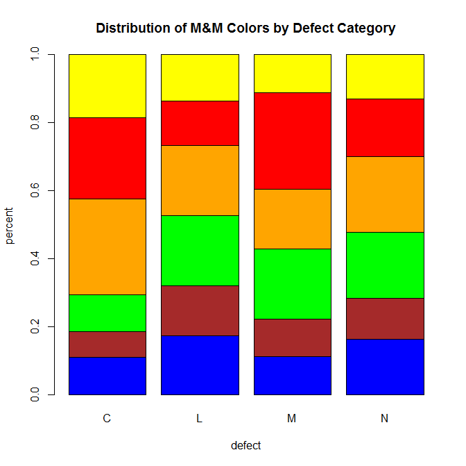
There are many optional arguments that you can add to your bar chart using barplot, some of which you've seen in the examples above. My favorites are the following:
| Option | What it does |
|---|---|
| main | Specify a main title to be displayed above chart |
| xlab | Specify text to describe the x-axis |
| ylab | Specify text to describe the y-axis |
| col=mm.colors | Sets the color palette to the colors that you have designated in the vector mm.colors |
| names.arg=mm.colors | Instead of labeling the x-axis with the categories from the raw data, this argument enables you to set up new labels for the bars, which can be useful if you are generating a bar chart from data within a data frame |
| legend=TRUE | Adds a box with a legend to the plot |
| horiz=TRUE | Orients the display of the bars horizontally instead of vertically |
| density=10 | Makes shaded bars instead of solid (I like to choose values between 8 and 22 here) |
Segmented bar charts are used to visualize conditional distributions, which show the distribution of one variable for only the cases that match a condition. For any contingency table that describes counts or proportions in terms of two categorical variables (that is, a two-way table), one segmented bar chart can be constructed for each of the two categorical variables.
Segmented Bar Charts Using ggplot
To produce a segmented bar chart the ggplot way, we have to go back to the command where we constructed the contingency table from spread (on the top of page 101) – only this time, we don’t need to do the spread part because ggplot only needs the tally of our M&M counts to be able to produce the chart. Even more conveniently, we can pipe the tallied output straight into ggplot with %>% and do the whole command in one fell swoop:
Do you need proportions on the vertical axis instead of counts? If so, all you need is to specify position and use the percent_format function from the scales package. Try it:
- The ggplot package also lets you stack the bars in different ways. Find out more here: https://thepracticalr.wordpress.com/2016/11/11/make-a-bar-plot-with-ggplot/