2.5 Comparative Box Plots
Objective
Box plots are a fantastic way to visualize the distribution of a quantitative variable, especially since they so clearly indicate the first and third quartiles, the median, and any outliers that are significant within the distribution. However, it can be even more useful to compare many distributions to one another, which is very easily accomplished by placing multiple box plots alongside each other. That’s what we’ll show in this chapter.
Loading Your Data
This data is available at a Google Sheets URL that was published to the web as CSV (comma separated values). We'll store it in the variable allscores, and will read it in using the smart read_csv command in tidyverse’s readr package which guesses our variable types:
# A tibble: 22 x 4
group pre post diff
<int> <dbl> <dbl> <dbl>
1 3 45.0 47.5 2.50
2 1 65.0 65.0 0.
3 1 52.5 40.0 -12.5
4 1 65.0 52.5 -12.5
5 1 60.0 52.5 -7.50
6 2 55.0 35.0 -20.0
7 2 50.0 45.0 -5.00
8 2 47.5 55.0 7.50
9 3 47.5 55.0 7.50
10 3 35.0 67.5 32.5
# ... with 12 more rows
This file contains test scores, one taken at the beginning of the semester (pre) and an identical one taken at the end of the semester (post). We want to see how much the students have improved – or not – during the course. We’ve also split the students up into three groups (group), and we want to take a look at whether there are performance differences between those groups. These are all things we can begin to investigate with comparative box plots, which can be created in two distinct ways.
With ggplot, we’ll need to have one column with the test type, and a second column with the test score – instead of a pre column and a post column. Fortunately we can gather those two columns together and recode them. To use this command, specify the key (the categorical variable that distinguishes different types of test scores) and pick a new column name using the value argument to hold the scores. The final arguments to gather are the columns you want to gather together under the new score column:
# A tibble: 44 x 4
group diff test.type score
<int> <dbl> <chr> <dbl>
1 3 2.50 pre 45.0
2 1 0. pre 65.0
3 1 -12.5 pre 52.5
4 1 -12.5 pre 65.0
5 1 -7.50 pre 60.0
6 2 -20.0 pre 55.0
7 2 -5.00 pre 50.0
8 2 7.50 pre 47.5
9 3 7.50 pre 47.5
10 3 32.5 pre 35.0
# ... with 34 more rows
(Note: THIS DOES NOT CHANGE THE DATA IN allscores… it just processes it and shows it to you.) Next prepare a boxplot with pre and post that will go on the left hand side, and a second boxplot with all scores that will go on the right hand side:
Finally, use plot_grid in the cowplot package to plot them side by side:
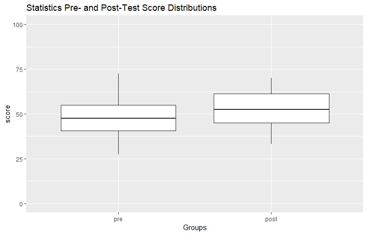
Maybe you want to publish the plot on the right-hand side in a journal… clearly, this isn’t publication-ready yet. Let’s fix that. First, you’ll need a title, which can be added with ggtitle. Let’s also get rid of the label on the x-axis (“test.type”), scale the y-axis from 0 to 100 (range of all scores), and switch box order since pre-tests were administered before post-tests. Let’s switch the order by using mutate to make test.type an ordered factor:
You can type right at the caret prompt and hit Enter if you want to see what the boxplot looks like already. But we’ll keep adding to it to make it the publication-ready plot we want before we display it below.
One of the most beautiful things about using tidyverse methods for data wrangling with dplyr, with the %>% pipe from magrittr, with the graphics methods from ggplot is that if you have functional sequences stored in a variable name, you can just keep adding to them. Watch this:
right + ggtitle("Statistics Pre- and Post-Test Score Distributions") +
scale_y_continuous(limits=c(0,100)) + xlab("Groups") +
scale_fill_manual(values=c("gray","white"))
This boxplot looks much better:
Note: Try adding another statement at the end, e.g. + theme_dark()
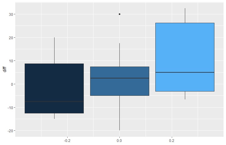
In the next example, we have a different goal based on the contents of the original dataset, allscores. We want to create a boxplot with group 1, 2, or 3 on the horizontal axis, and the distributions of score differences (from the diff column) on the vertical axis. Fortunately, the data in allscores is in the right format already (the group column lists either 1, 2, or 3, and the diff column contains the value of posttest-pretest scores which represents how much each student has improved over the semester). Check out how adding arguments changes the nature of the plot:
I like the one on the far right the best, but I’d like to add titles and axis labels to it, and either change the colors (or get rid of that annoying fade-bar on the far right). Removing the fade bar can be done with p3 + guides(fill=FALSE) which produces this:
If you want to make the first box white, and the second gray, and the third a darker gray, you might think of using scale_fill_manual:
Error: Continuous value supplied to discrete scale
But the reason why the fade-bar was there in the first place is that the data type for the group variable is integer rather than factor. Fortunately we can use mutate like earlier:
This shows that the median improvement for Group 1 isn’t actually an improvement… test scores decreased overall, even though the distribution is skewed towards improvements. Fortunately, the median score differences are positive for Groups 2 and 3, and there were fewer sinking scores in Group 2 than Group 3. There is much more variation in Group 3, and the distribution is somewhat skewed towards higher scores. In Group 3, 50% of the measured improvements were between -4 and 32.5 (the interquartile range). By now, you’re probably wondering what the difference is between Groups 1, 2, and 3… and the answer is class attendance. The students in Group 1 were absent most frequently, and the students in Group 3 had fantastic attendance. Group 2 only had two or three absences. As you can see, it looks like Group 3 performed the best… but we would have to do a couple Two-Sample t-tests or a One-Way Analysis of Variance (ANOVA) to know for sure.
Notice how easy it is as well to flip the chart on its side using coord_flip(). The only tricky part is remembering to clean up the y-axis (underlined) instead of the x-axis: