2.9 Scatterplots, Covariance, and Correlation
Objective
To create scatterplots from two different continuous quantitative variables, and evaluate the scattered-ness of the points using covariance and correlation.
Background
The simplest form of a scatterplot shows points scattered in two dimensions. The variable on the horizontal x-axis is the independent variable, or predictor, and the variable on the vertical y-axis is the dependent variable, or response. Each point is plotted as an (x,y) pair. We will use the same weather data set that we did in the last chapter to produce this chart:
You can get a sense of the scattered-ness of the points by finding their covariance and correlation, which describe the relationship between two continuous quantitative variables:
Quantitative variables are positively related if, when one increases, the other one also increases.
Quantitative variables are negatively related if, when one increases, the other one decreases.
Correlation is computed using the covariance, so they’re closely related. Both covariance and correlation indicate whether variables are positively or negatively related to one another. Correlation, however, also tells you the extent to which the variables change with respect to one another.
Here is a scatterplot with average daily temperature as the independent variable, and dewpoint (the temperature below which water vapor starts to condense) as the dependent variable. Each point is plotted as a (temp, dewp) pair.
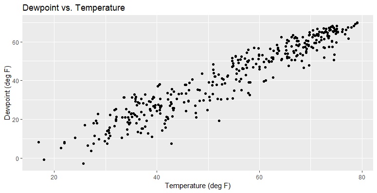
The plot above was produced with the code below. All the heavy lifting happens on the first line; you can cut and paste the entire first line but chop off the last + to get the plot without any of the labels.
wx %>% ggplot(aes(x=temp, y=dewp)) + geom_point() +
ggtitle("Dewpoint vs. Temperature") +
xlab("Temperature (deg F)") +
ylab("Dewpoint (deg F)")
(Try adding shape=19 or size=3 or col="red" inside geom_point() too.)
Covariance is computed like this: for the first point in your data set, compute the difference between the x coordinate of that point and the mean of all the x coordinates, then do the same for y and multiply those two values together. Then, do that for all the rest of the points! Add up the n products that you computed. Then, when it's all added up, divide by one less than the total number of points (n - 1):

The correlation coefficient, r, can be calculated by taking the covariance of the data (sxy) and dividing it by the standard deviation of the x coordinates (sx) multiplied by the standard deviation of the y coordinates (sy):

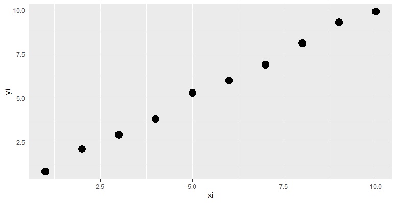
The correlation coefficient ranges between -1 (perfect negative correlation) and +1 (perfect positive correlation) UNLESS all the points lie EXACTLY along a horizontal or vertical line. Why? Because on a horizontal line, sy is zero, and on a vertical line, sx is zero. Since you can't divide by zero, you can't compute a correlation coefficient for points lying exactly on a horizontal or vertical line. Next, we will calculate covariance and correlation for a small data set, both analytically and by using the R commands that make it easy for us. First, let’s generate data that will have a correlation coefficient of nearly +1 and plot it:
Here is the scatterplot of our (xi, yi) points, with large (size=5) dots plotted:
Now it's time to compute the covariance and correlation coefficient. We will need the difference between each x coordinate and the mean of the x's (xi.minus.xbar) as well as the difference between each x coordinate and the mean of the y's (yi.minus.ybar). For each point i, we multiplied these two values together to get xdiff.x.ydiff. Let’s put them in a data frame called calc.df which will help us compute covariance and correlation:
i xi yi xi.minus.xbar yi.minus.ybar xdiff.x.ydiff
[1,] 1 1 0.8 -4.5 -4.71 21.195
[2,] 2 2 2.1 -3.5 -3.41 11.935
[3,] 3 3 2.9 -2.5 -2.61 6.525
[4,] 4 4 3.8 -1.5 -1.71 2.565
[5,] 5 5 5.3 -0.5 -0.21 0.105
[6,] 6 6 6.0 0.5 0.49 0.245
[7,] 7 7 6.9 1.5 1.39 2.085
[8,] 8 8 8.1 2.5 2.59 6.475
[9,] 9 9 9.3 3.5 3.79 13.265
[10,] 10 10 9.9 4.5 4.39 19.755
To find the covariance, we can do this (the expression on the far right is the R code that we will use with our data to perform the calculation):
Doing this in R, we get:
But there's an easier way! R will generate the covariance just with the cov command. All we have to do is supply it with the vectors containing the original coordinates for our points:
You can see that we got the same values when we used the equation, and calculated each of the pieces of the covariance, as we did when we just asked R to compute it for us from our data. Now that we have the covariance, it is also easy to compute the correlation coefficient. We just divide the covariance by the standard deviations in x and in y. Similar to the covariance, R also provides an easy way to compute the correlation coefficient straight from your data using the cor command. The results you get from the manual calculation, and from asking R to do it for you, will be the same:
For the rest of the examples in this chapter, we’ll continue to use the data frame of daily weather observations reported throughout 2013 from the Shenandoah Valley Airport (SHD) near Harrisonburg, Virginia. Each column contains one variable, and there are 365 rows (one for each day of the year). They are arranged in day order, with January 1st on the 1st row, and December 31st on the last.
# A tibble: 365 x 10
yearmoda temp dewp stp visib wdsp mxspd max min prcp
<int> <dbl> <dbl> <dbl> <dbl> <dbl> <dbl> <dbl> <dbl>
<dbl>
1 20130101 43.3 25.8 971. 10.0 5.40 8.90 47.8 37.8 0.
2 20130102 38.5 29.4 973. 10.0 1.50 5.10 42.3 32.0 0.
3 20130103 32.0 19.2 978. 10.0 1.40 7.00 42.6 21.9 0.
4 20130104 34.6 17.4 978. 10.0 3.60 8.90 45.9 26.2 0.
5 20130105 36.0 17.9 981. 10.0 3.40 8.00 48.2 25.9 0.
6 20130106 40.6 26.9 977. 9.90 3.80 9.90 47.1 31.1 NA
7 20130107 40.6 26.1 982. 10.0 2.20 12.0 44.8 30.7 0.
8 20130108 36.9 23.8 985. 10.0 3.00 13.0 56.3 24.1 0.
9 20130109 39.1 30.5 984. 10.0 2.90 13.0 62.8 25.3 0.
10 20130110 46.1 29.6 988. 10.0 2.00 8.90 57.2 29.3 0.
# ... with 355 more rows
When we display a tibble (a fancy data frame), it automatically shows the structure of our data. And when you use readr to import your data, it will make guesses about the best data type to bring your data in as. In this case, the date has been pulled in as an integer, and the rest of the variables are of type double (for “double precision floating point numbers”). These values have decimals in them (which we can see also in the data that’s displayed). We want to add a categorical variable, season, to enhance our scatterplot later by coloring the points for each season uniquely. Using equinoxes and solstices and season boundaries, spring will start on March 21st, summer on June 21st, and fall on September 21st (approximately). We can use the amazing package lubridate to label our seasons quickly.
First, let’s change all those integer dates to actual dates:
# A tibble: 365 x 10
yearmoda temp dewp stp visib wdsp mxspd max min prcp
<date> <dbl> <dbl> <dbl> <dbl> <dbl> <dbl> <dbl> <dbl>
<dbl>
1 2013-01-01 43.3 25.8 971. 10.0 5.40 8.90 47.8 37.8 0.
2 2013-01-02 38.5 29.4 973. 10.0 1.50 5.10 42.3 32.0 0.
3 2013-01-03 32.0 19.2 978. 10.0 1.40 7.00 42.6 21.9 0.
4 2013-01-04 34.6 17.4 978. 10.0 3.60 8.90 45.9 26.2 0.
5 2013-01-05 36.0 17.9 981. 10.0 3.40 8.00 48.2 25.9 0.
6 2013-01-06 40.6 26.9 977. 9.90 3.80 9.90 47.1 31.1 NA
7 2013-01-07 40.6 26.1 982. 10.0 2.20 12.0 44.8 30.7 0.
8 2013-01-08 36.9 23.8 985. 10.0 3.00 13.0 56.3 24.1 0.
9 2013-01-09 39.1 30.5 984. 10.0 2.90 13.0 62.8 25.3 0.
10 2013-01-10 46.1 29.6 988. 10.0 2.00 8.90 57.2 29.3 0.
# ... with 355 more rows
And set some time intervals to represent the seasons:
Now, armed with a definition of our seasons, we can use mutate to create a new data frame called wx2 with a new variable called season:
This produces a data frame we can use for making even prettier scatterplots:
# A tibble: 365 x 11
yearmoda temp dewp stp visib wdsp mxspd max min prcp season
<date> <dbl> <dbl> <dbl> <dbl> <dbl> <dbl> <dbl> <dbl>
<dbl> <chr>
1 2013-01-01 43.3 25.8 971. 10.0 5.40 8.90 47.8 37.8 0. winter
2 2013-01-02 38.5 29.4 973. 10.0 1.50 5.10 42.3 32.0 0. winter
3 2013-01-03 32.0 19.2 978. 10.0 1.40 7.00 42.6 21.9 0. winter
4 2013-01-04 34.6 17.4 978. 10.0 3.60 8.90 45.9 26.2 0. winter
5 2013-01-05 36.0 17.9 981. 10.0 3.40 8.00 48.2 25.9 0. winter
6 2013-01-06 40.6 26.9 977. 9.90 3.80 9.90 47.1 31.1 NA winter
7 2013-01-07 40.6 26.1 982. 10.0 2.20 12.0 44.8 30.7 0. winter
8 2013-01-08 36.9 23.8 985. 10.0 3.00 13.0 56.3 24.1 0. winter
9 2013-01-09 39.1 30.5 984. 10.0 2.90 13.0 62.8 25.3 0. winter
10 2013-01-10 46.1 29.6 988. 10.0 2.00 8.90 57.2 29.3 0. winter
# ... with 355 more rows
Preparing Your Scatterplots
You can generate a scatterplot to show the relationship between any two quantitative variables. But you can also visualize the relationships between those variables across multiple groups – for example, across all of the seasons in our weather dataset. In the next example, we’ll create the same scatterplot as before, only this time we’ll make each point on the scatterplot a different shape and color based on the season it was observed.
There are several different plot characters you can place on your scatterplots:

Use scale_shape_manual to pick which plot characters you want. For example:
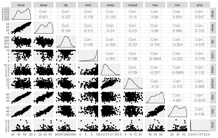
In the examples above, we only examined the relationship between two of the quantitative variables in the data set: average daily temperature and dewpoint. But what if we're just in the beginning stages of exploring our dataset, and we want to find out quickly whether there are relationships between the variables that we should examine further? To explore this, we can use ggpairs from the GGally package.
From just a quick glance, some patterns are evident in the display. First, there is a clear linear relationship between average daily temperature and dewpoint, average daily temperature and maximum (max) and minimum (min) temperatures, and dewpoint and maximum and minimum temperatures. There is also an interesting relationship between visibility (visib) and wind speed (wdsp): as wind speed gets higher, the visibilities tend to increase, although low wind speeds are associated with the full range of visibilities. Temperatures are higher in the middle of the data set (during the days that correspond to summer) and they are lower at the beginning and end of the data set (during the days that correspond to winter).
Other Resources:
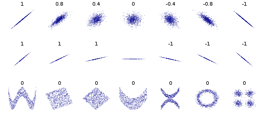
- The "official" name for the correlation coefficient we talked about in this chapter is the Pearson Product-Moment Correlation Coefficient. There is a great Wikipedia page on the correlation coefficient at http://en.wikipedia.org/wiki/Pearson_product-moment_correlation_coefficient, which also includes this fantastic image below showing the wide variety of scatterplot shapes that are associated with different scatterplot shapes:
Why is the correlation coefficient always between -1 and +1? Stackexchange has a nice little proof of why this will always be the case (calculus required): http://math.stackexchange.com/questions/564751/how-can-i-simply-prove-that-the-pearson-correlation-coefficient-is-between-1-an
Virtual Nerd has a nice video about how to make scatterplots manually: http://www.virtualnerd.com/pre-algebra/linear-functions-graphing/scatter-plot-best-fit-lines/scatter-plots-predictions/scatter-plot-example
You can also create prettier scatterplot matrices using functions in the lattice and car packages in R. Details about how to use those can be found here: http://www.statmethods.net/graphs/scatterplot.html