2.4 Box Plots
Objective
Box plots provide an alternative to histograms, providing a way to visualize the distribution of a quantitative variable while accentuating some of the features of the dataset (like outliers, the interquartile range or IQR, and the median). We'll talk more about each of these features in this chapter.
Background
To demonstrate the similarity between box plots and histograms, and also to explain concepts like the IQR and illustrate how they "pop out" on a box plot, we'll simulate data that represents the daily high temperatures for some midlatitude location on 40 randomly sampled days of the summer. Say we know that this particular location has an average high temperature of 76 degrees Fahrenheit, which is approximately normally distributed, with a standard deviation of 9 degrees Fahrenheit. We can generate simulated data using the rnorm command, which generates a vector of random numbers sampled from a particular normal distribution. We make it a data frame because ggplot can only handle data frames:
We can ask R to provide us with some descriptive statistics about the data we've just randomly generated. First, we'll get the header of our 40-element vector using the head command, and then we'll ask for a summary of the descriptive statistics, followed by the "five number summary" that we obtain using the fivenum command. Your numbers will be different, because you’ll have different simulated data, and that’s OK – it will have the same statistical properties as the data here.
Min. 1st Qu. Median Mean 3rd Qu. Max.
62.85 70.26 75.42 76.41 80.61 97.45
From the head command, we can see that our first randomly generated temperature was approximately 92.7, the next one was around 70.8, and so forth. The summary command tells us the minimum value in our dataset, the temperature at which the first quartile (Q1) is located, the median, the mean, the temperature at which the third quartile (Q3) is located, and the maximum value in our dataset. The five number summary doesn't label its output, but in order from left to right it tells us the minimum, the first quartile, the median, the third quartile, and the maximum value in our dataset. (The fivenum command leaves out the mean, which the summary provides.)
What do all these values mean?
The minimum is the smallest value in our dataset.
The first quartile (Q1) represents the point at which 25% of our observations fall below that value (and thus 75% of our observations are above that value).
The median represents the point at which 50% of our observations fall below that value (and thus 50% of our observations are above that value).
The mean represents the average value of all our observations. If our distribution is perfectly symmetric, the mean and the median will be the same. If our distribution is not symmetric, the mean will be pulled in the direction of the tail more dramatically than the median. You can think of it this way: consider a distribution of all of the ages of people in your class or workplace. Now, imagine that one person (obviously an outlier) joins your group, and he or she is 100 years old. The average age of your colleagues is going to be pulled significantly higher, whereas the median will stay about the same (because that just indicates that 50% of the observations are below that value, and 50% of observations are above - and we've only added one observation).
The third quartile (Q3) represents the point at which 75% of our observations fall below that value (and thus 25% of our observations are above that value).
The maximum is the largest value in our dataset.
The boxplot, however, gives us even more information -- by showing us the interquartile range, or IQR, of our data. The interquartile range is the distance between the first and third quartiles, and contains 50% (half) of all our observations:
IQR = Q3 - Q1Because we know that 25% of our observations are below Q1, and another 25% of observations are above Q3, this implies that exactly half of our observations - 50% of our observations - will fall between Q1 and Q3. And that's the purpose of the box in the box plot: to clearly show the space within which half of our values lie, while clearly showing us the median (indicated by a heavy line somewhere near the middle of our box).
But that's not all! The boxplot also gives us more information in the form of a lower limit and an upper limit! These values provide a heuristic (or rule of thumb) to use when we're trying to determine whether we have any outliers in our dataset, and if so, which values they are. The conventions for calculating our lower and upper limits are:
Lower Limit = Q1 - 1.5 x IQR
Upper Limit = Q3 + 1.5 x IQR
Values below the lower limit are outliers. Values above the upper limit are outliers. (Note: R provides you the option of changing this equation, and thus changing the lower and upper limits you plot on your boxplot, by using the range argument to the boxplot command. Don't do this!!! Ever!!! People are used to seeing boxplots that have been constructed with one and a half times the size of the IQR. If you change that value, their perception of how your data is distributed may not be accurate. So the only reason I could think of that you might want to change this range is if you were deliberately trying to manipulate peoples' perception of your data. Like I said before... don't do it.)
Now that you know what all the components of a box plot are, it should be easy to see how a box plot and a histogram are similar, but how a box plot communicates far more information about the contents of your data set. We will use the simulated high temperature data that we generated earlier to generate a boxplot and a histogram, and see how they compare. The boxplot is tilted horizontally to enable direct comparison:
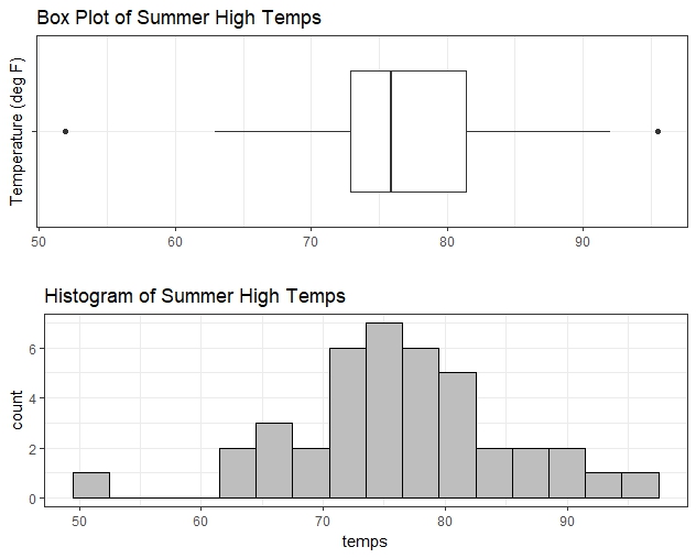
Here is the R code that did this:
First we set up the top plot by calling ggplot and telling it that we want to use temps.df as our data set. Since there is only one variable temps, we provide this as the y data – specifying x would split our plot into multiple boxes based on groups, but we only have one group. Next, we call geom_boxplot to specify plot type. The coord_flip command tips the box on its side, so that it sits horizontally instead of vertically. After following a similar process for the bottom plot, we render them together, in a single column with one on top of the other (ncol=1) by the plot_grid function in the cowplot package.
Here is an overview of what information is provided by the fivenum and summary commands in R, versus what values are denoted on the boxplot when it's graphed:
| Min | Lower Limit: Q1 - 1.5(IQR) | Q1 | Median | Mean | Q3 | Upper Limit: Q3 + 1.5(IQR) | Max | |
|---|---|---|---|---|---|---|---|---|
| fivenum | ✔ | ✔ | ✔ | ✔ | ✔ | |||
| summary | ✔ | ✔ | ✔ | ✔ | ✔ | ✔ | ||
| What's Marked on Box Plot | ✔ | ✔ | ✔ | ✔ | ✔ |
Drawing a Box Plot with Comprehensive Labeling
For this example, we will simulate some more data to use for preparing the box plot. This data generation example is taken from the documentation for the ddply command, which is contained inside the plyr package (a tidyverse package that lets you manipulate your data in highly sophisticated and totally useful ways that we won't cover in this book):
This example creates a data frame called dfx with three variables, each of which forms one of the columns of the data frame: group, sex, and age. The group variable is created by replicating the letter A 8 times, then following it with 15 instances of the letter B, then ending with 6 instances of the letter C. The sex variable is created by asking R to perform a random sample of the values M and F, representing male and female, and to do it 29 times with replacement (meaning that we can continue to randomly select M's and F's as long as we want... we won't run out of them). The age variable is created by randomly selecting 29 values from a uniform distribution that ranges from the lowest value of 18, to the highest value of 54. (Note: "runif" isn't a conditional statement that tells R to "run if" some condition is met. It stands for random uniform... a way to generate randomly selected variables from a uniform distribution.)
The data will look something like this (remember that YOUR data will be different, because every time you simulate data, you'll get values that are unique to your simulation):
Generating a box plot with labels takes a little bit of a trick, but it's not that hard to do in base R. First, we have to create our box plot labels out of the data from the five number summary, which works as long as we don't have any outliers:
Next, we create the box plot out of the age variable within the dfx data frame:
And then finally, we add text to the box plot that specifies our critical points on the diagram, so that the box plot communicates the story of our data better:
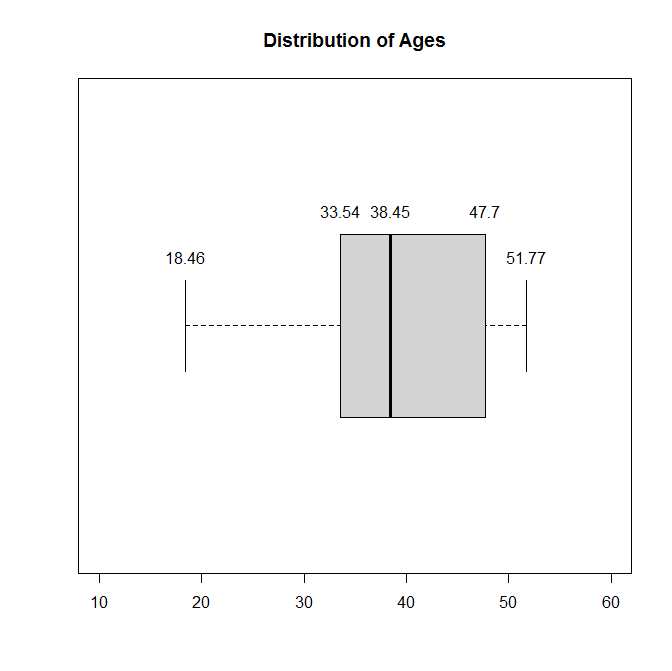
By specifying values for y, we are telling R to plot our labels slightly above the horizontal line that goes through the center of our box plot. The first and last values will be printed slightly above that line, and the middle three values will be printed much further up.
On a different day (with different simulated data), I labeled a boxplot with ggplot. The fun.y=quantile runs the five number summary for you. The 0.42 tells how far away from the center of the plot the label will be added (I got it through lots of trial and error):
Try the code and see what output you get. Also try this to see what changing the nudge does:
The box plot is also sometimes called a "box and whiskers" plot, where the “whiskers” end at the lower limit and upper limit. It's easier to see why they might be called whiskers if the box plot is drawn horizontally, and enhanced with some very bad art, as in this rendition of the summer high temperatures boxplot that you saw earlier in this chapter:
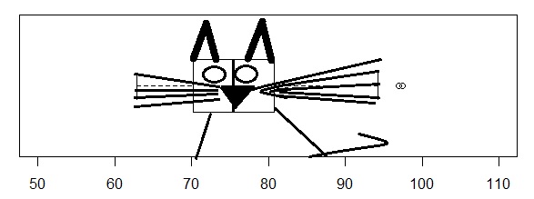
Note: Two people have complained by email to say that the inclusion of this art is “unprofessional.” Here is my formal apology to those two people for leaving it here.
Other Resources:
How to find the interquartile range (IQR) from a small dataset, analytically: http://www.wikihow.com/Find-the-IQR
This post shows you how to label outliers in your R boxplot: http://www.r-statistics.com/2011/01/how-to-label-all-the-outliers-in-a-boxplot/